
Hello once again! Jason here with part two of the UI piece of our Pixel Pitch Dev Blog. This is the second post of the series and will again address the User Interface.
To recap, we left off after having mapped the UI and come up with the code to activate and disable menu panels of buttons as necessary. Now at this point, we had basic white squares for buttons and white squares for the background of those menus. These panels as you might have guessed were pretty hard to see because – well you couldn’t see white on white. Unity does have an asset store with which we could purchase or sometimes download assets for free. However, we wanted to stick with assets that we created.
I talked to one of our artists, Melanie, to create some concept ideas for our own buttons and panels. While we knew that the first version of this visual theme for the UI was not going to be what we wanted, we needed something to start with and to allow us to use the design. Full disclosure, I am not an artist and since I just needed buttons ( and did not put in the time to research a visual theme ) the requests I made were not the best design. The effort, however, and Melanie’s willingness to just come up with something as it was requested, was greatly appreciated. So here is what we had initially and then what I requested as the first version of the UI –
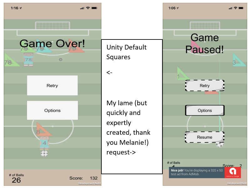
You might notice that there is a semi-transparent background for both of these; which is what we decided to do as a solid background didn’t look good.
With a basic UI design in place, we moved on to finish art and sound asset requests for the gameplay as well as tackle some light coding to get our game features working as desired. Part 3 of the UI blogs will cover where we decided to display information on the screen and a lesson learned on pushing development builds out that the entire team can access.